A full redesign in 2 months — then building the foundation.
Leading five designers through the visual and UX transformation of DOOR — a property-management platform spanning a web SaaS, two mobile apps, packaging, and a new website.
(product, brand, motion)
Turning a new visual identity into a better product experience.
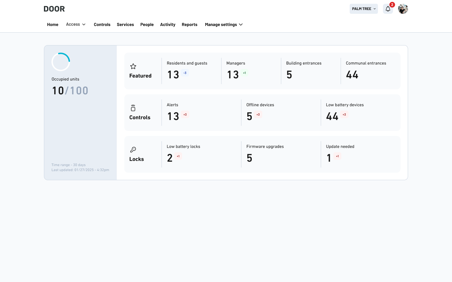
Rapid growth left DOOR with fragmented experiences across its property-management SaaS and resident app – split by mismatched typography, visual inconsistency, and disjointed UI components.
Partnering with a brand agency gave us the clear foundation we needed. Bringing them in was the right call at the right time – historically, too many internal stakeholders had competing visions, making an outside perspective essential to align everyone on a single direction.
We seized this momentum as an opportunity for the design team to bridge the gap between brand and product – rebuilding the user experience from the ground up, with our customers firmly at the center.
The usual outcome is a brand book that lives in a Pitch deck while the product stays the way it was.
The bet: do both, in sequence.
There were two obvious options: repaint the product and move on, or use the rebrand as cover to rebuild the layouts underneath.
I took a third — do both, in sequence, so neither engineering nor the business had to wait for the other. Two redesign phases, each independently shippable, sixty days end to end — and then a third phase that has no end date, because that one is about how the product thinks. The rule I set for the team: never ask engineering for a big bang.
Skin
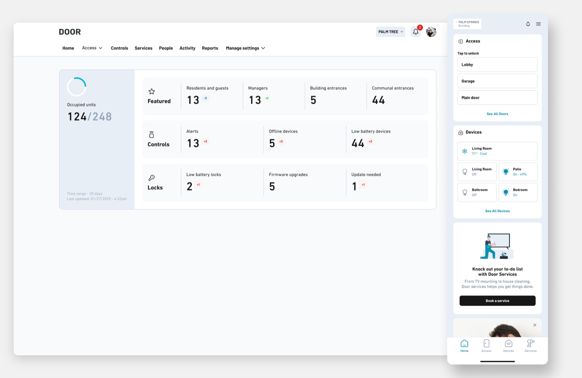
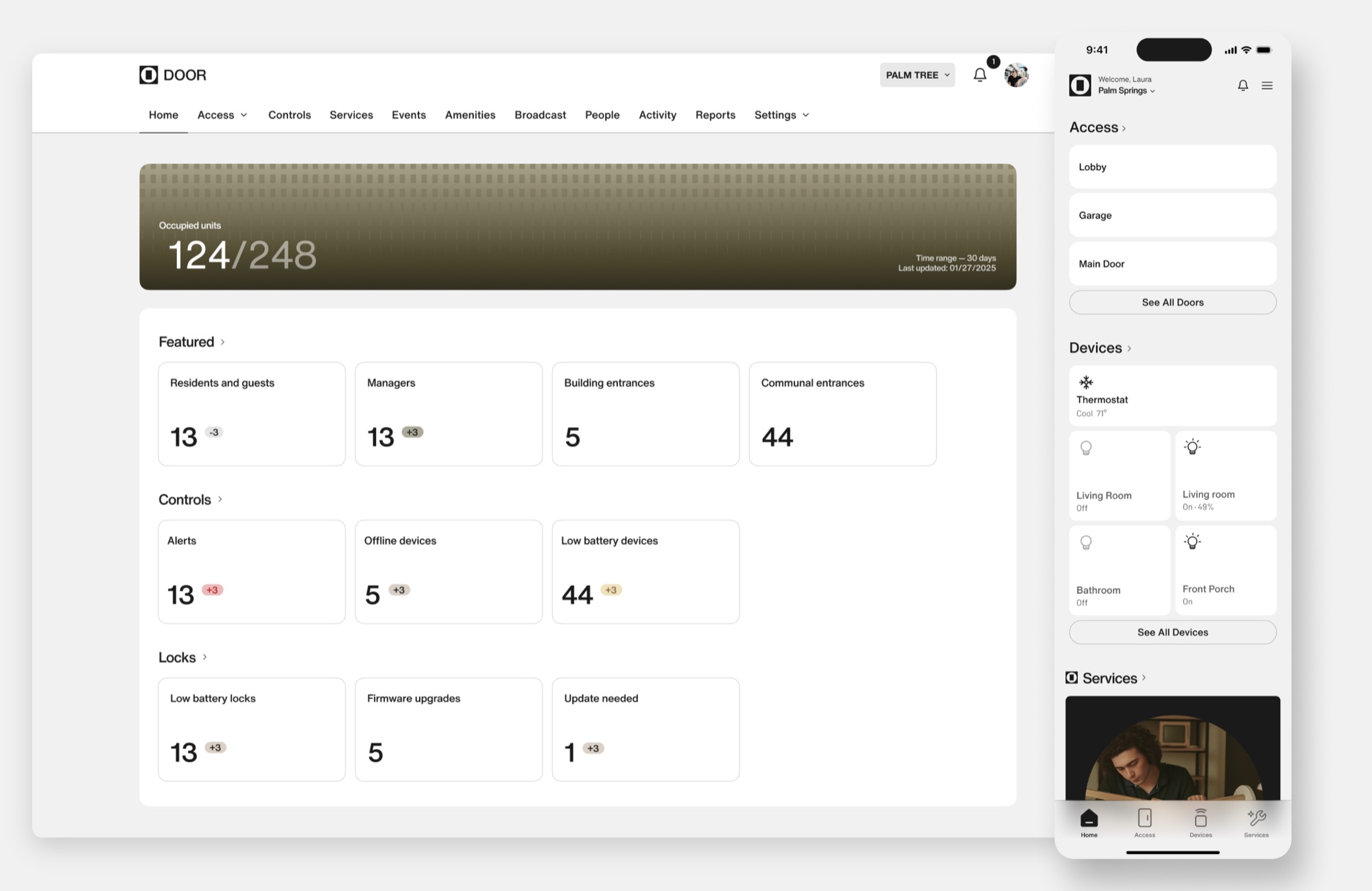
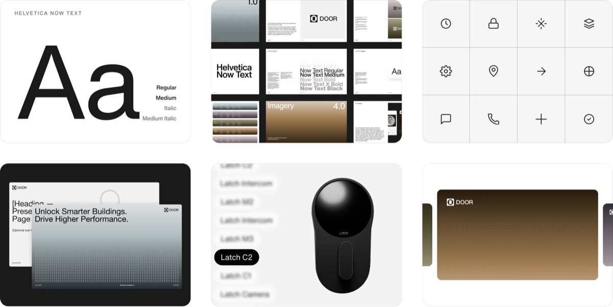
New tokens, type scale, iconography and component styling applied across DOOR OS and both mobile apps. No layout changes. No new logic.
That constraint is what made it fast: the full redesign landed dev-ready in four weeks and shipped in one engineering cycle instead of a quarter. The business got a coherent brand in production before we'd touched a single flow.
Deep redesign
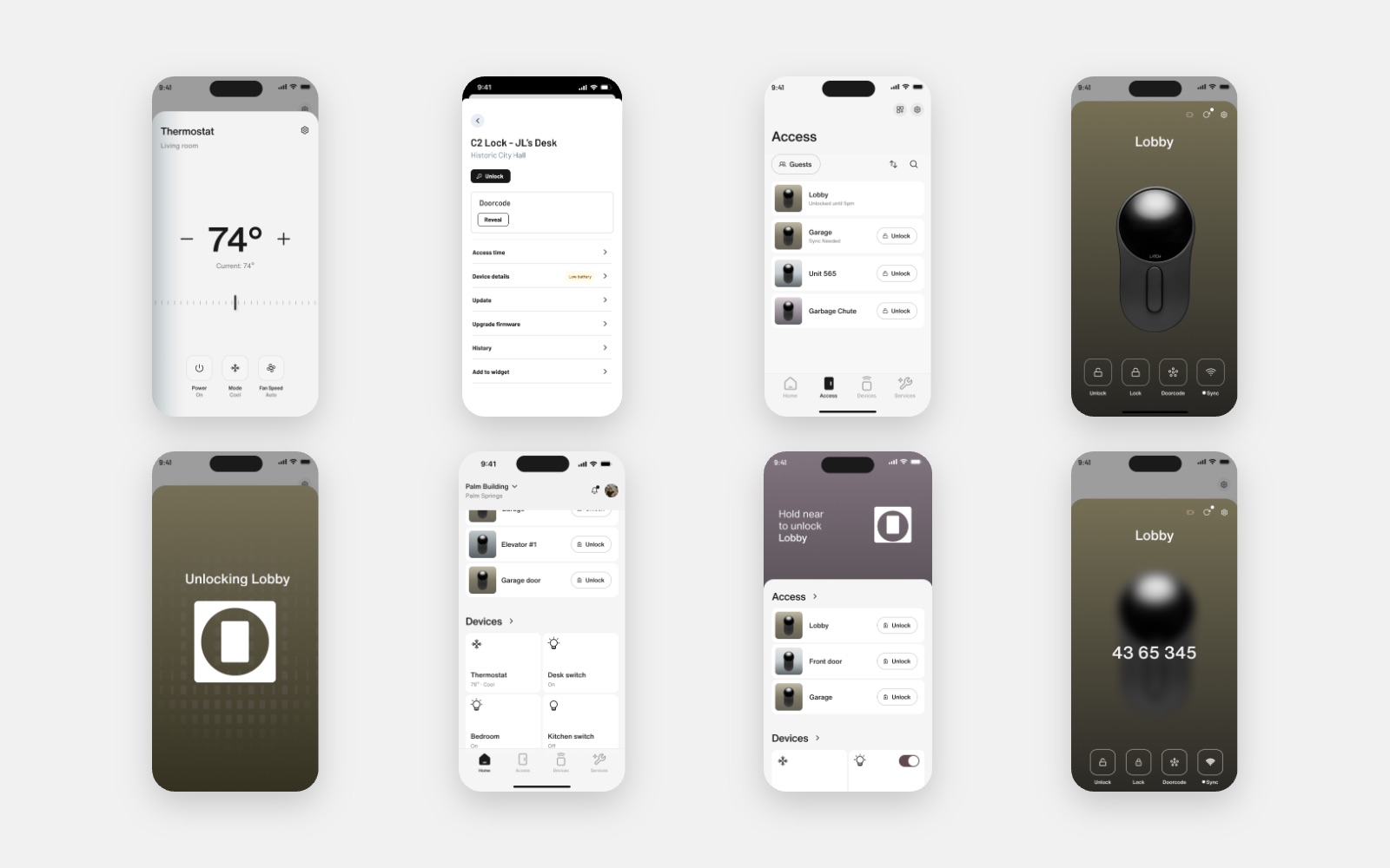
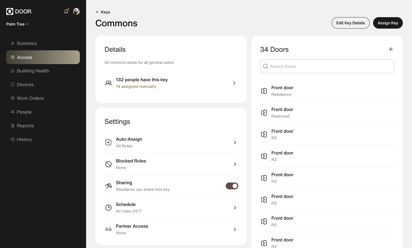
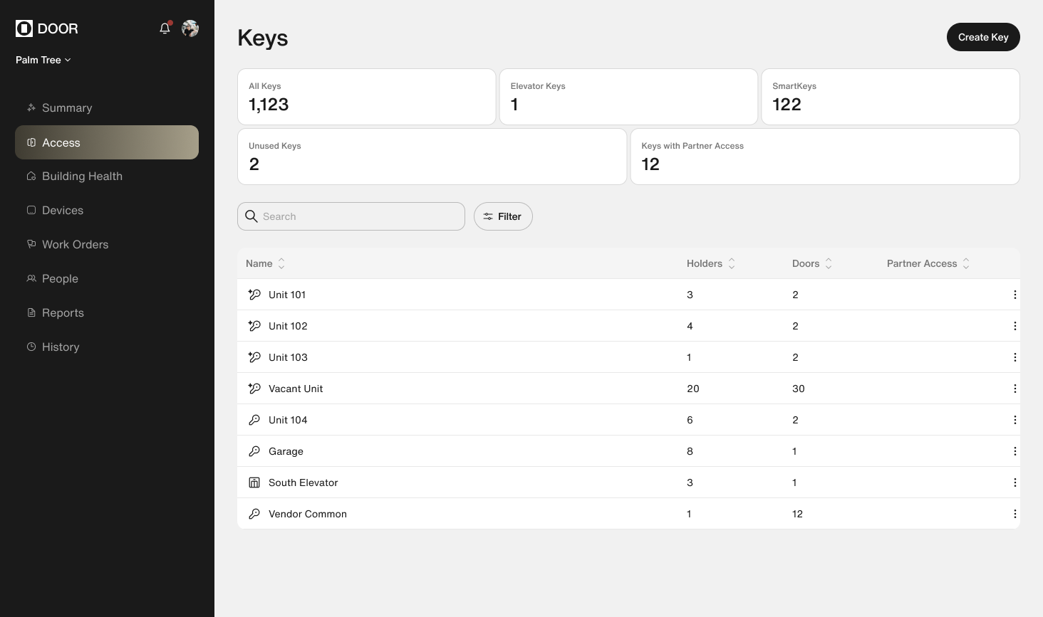
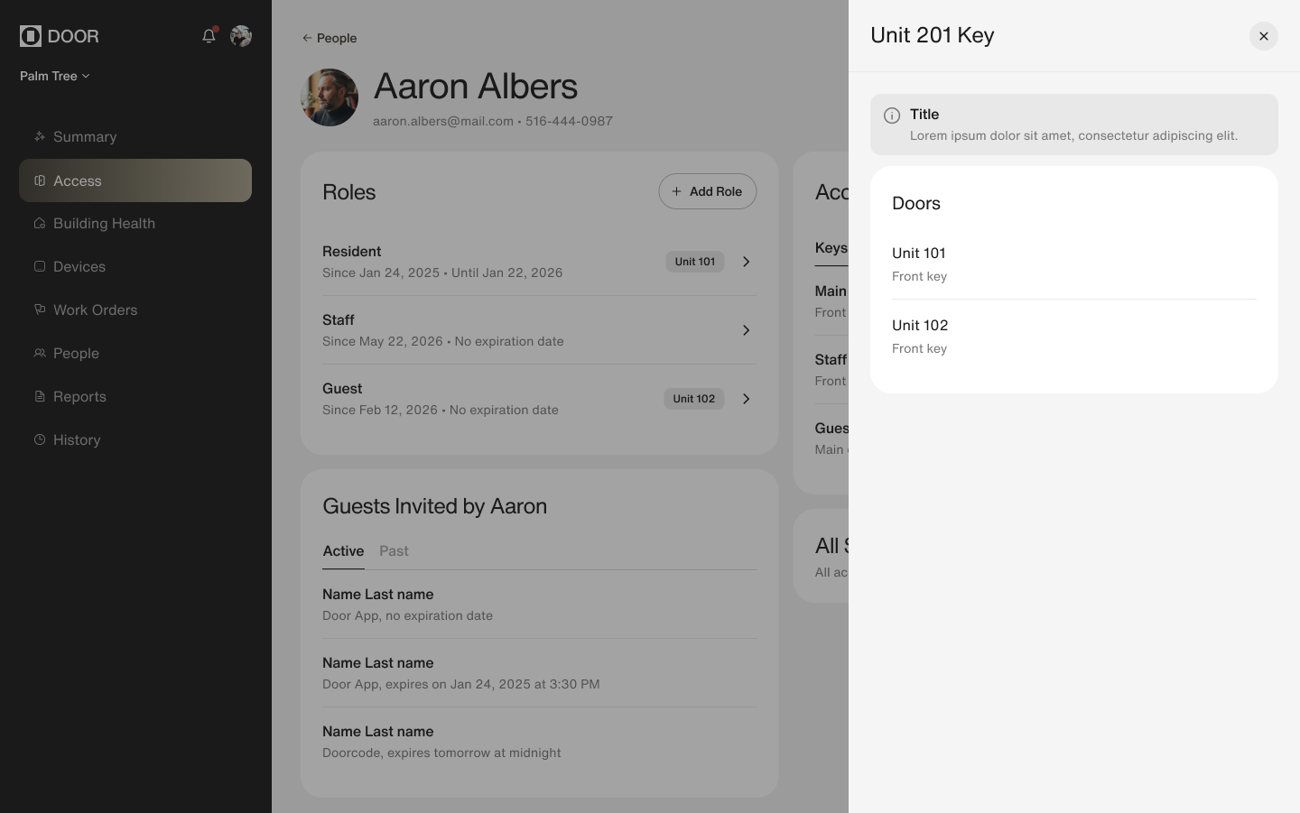
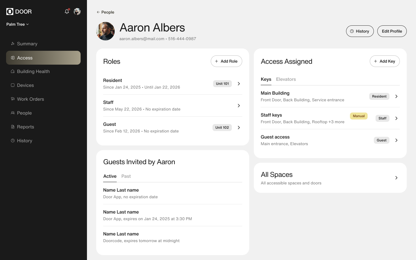
With tokens, type and the component library signed off, the team stopped repainting and started rebuilding. Every product went into UX redesign — DOOR OS, the resident app, the property-manager app — all of them in parallel, five designers working against one system instead of three.
To get there we went deep into process — mapping a customer journey map for every piece of the resident and manager experience, then redesigning each leg of that journey on top of the new system. Engineering never received a two-hundred-screen handoff: work went out flow by flow, in the order the roadmap needed it, so devs always had something ready to build and never had to stop and absorb a redesign.
Intelligence
This is where we are now. The brand holds, the UX is sound, every surface speaks the same language — so the ceiling moved. The problem is no longer that the sections look different; it's that they still behave like separate products that happen to live in one app.
So the work shifted from layout to mindset: the product should decide what matters and lead with it, instead of asking people to check eleven places and assemble the answer themselves.
Unlike the first two phases, this one has no ship date. It's the foundation — and it keeps going.
Rethinking mobile around who's holding the phone.
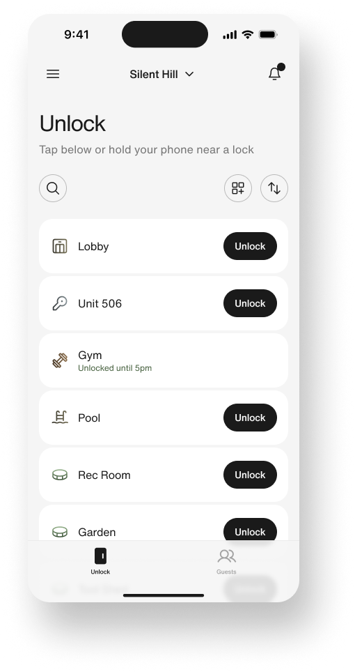
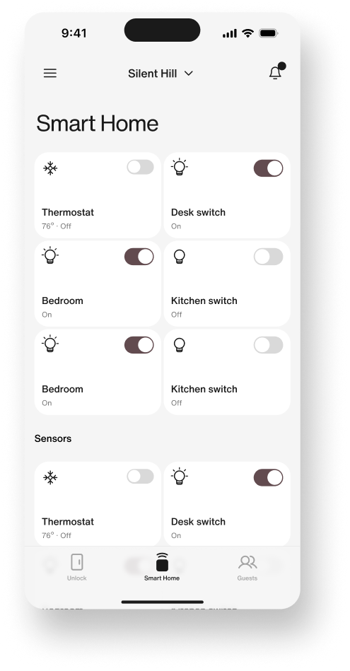
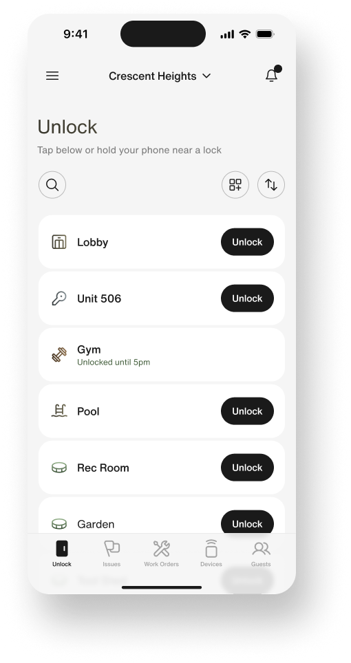
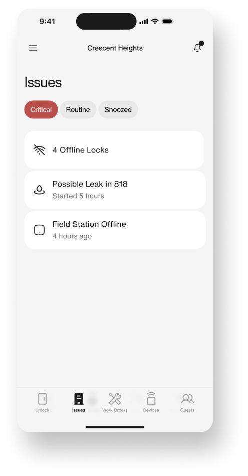
One app had been serving two people with opposite jobs. Residents open it to ask one question — let me in — with smart-home control a distant second. Staff need to get through doors too, but the rest of their day is spotting what's broken and fixing it on the move.
So the mobile experience splits by role instead of by feature list. Unlock is the home screen for both — and everything under it is built around what that person came to do.
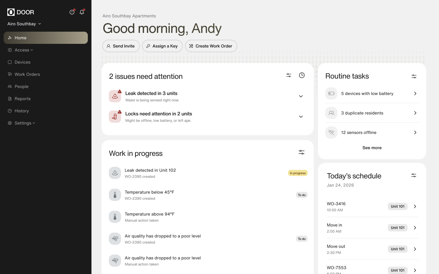
A dashboard that triages.
DOOR OS had grown by addition — every capability its own top-level nav item, every counter its own card. A manager could read the whole screen and still not know what to do next.
The direction in design now: alerts, offline devices and low-battery locks pulled out of buried settings and onto the home surface, grouped by what needs action. 2 issues need attention leads, then work in progress, today's schedule, property health. The manager stops reading the interface and starts making decisions.
Beyond the product
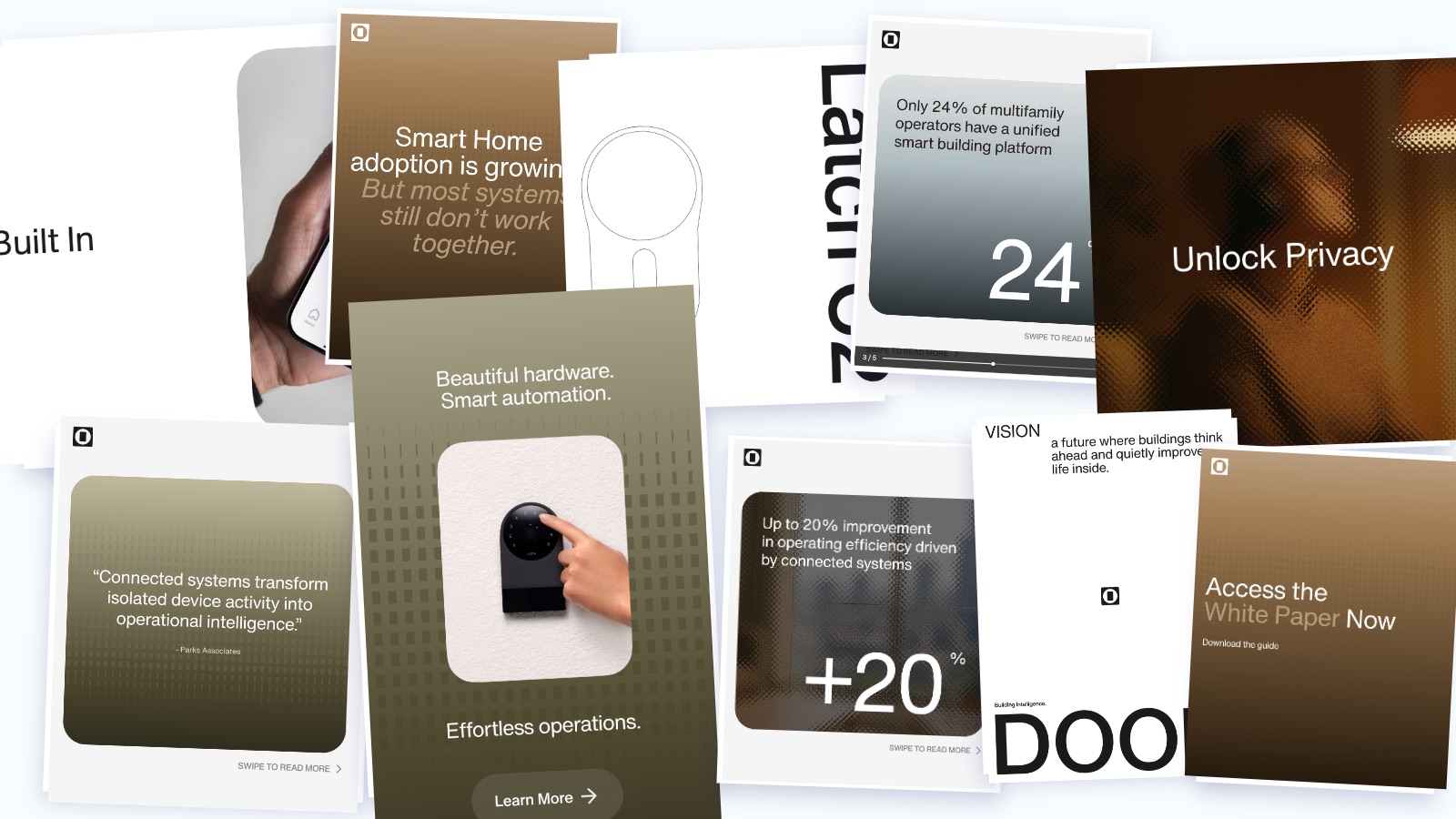
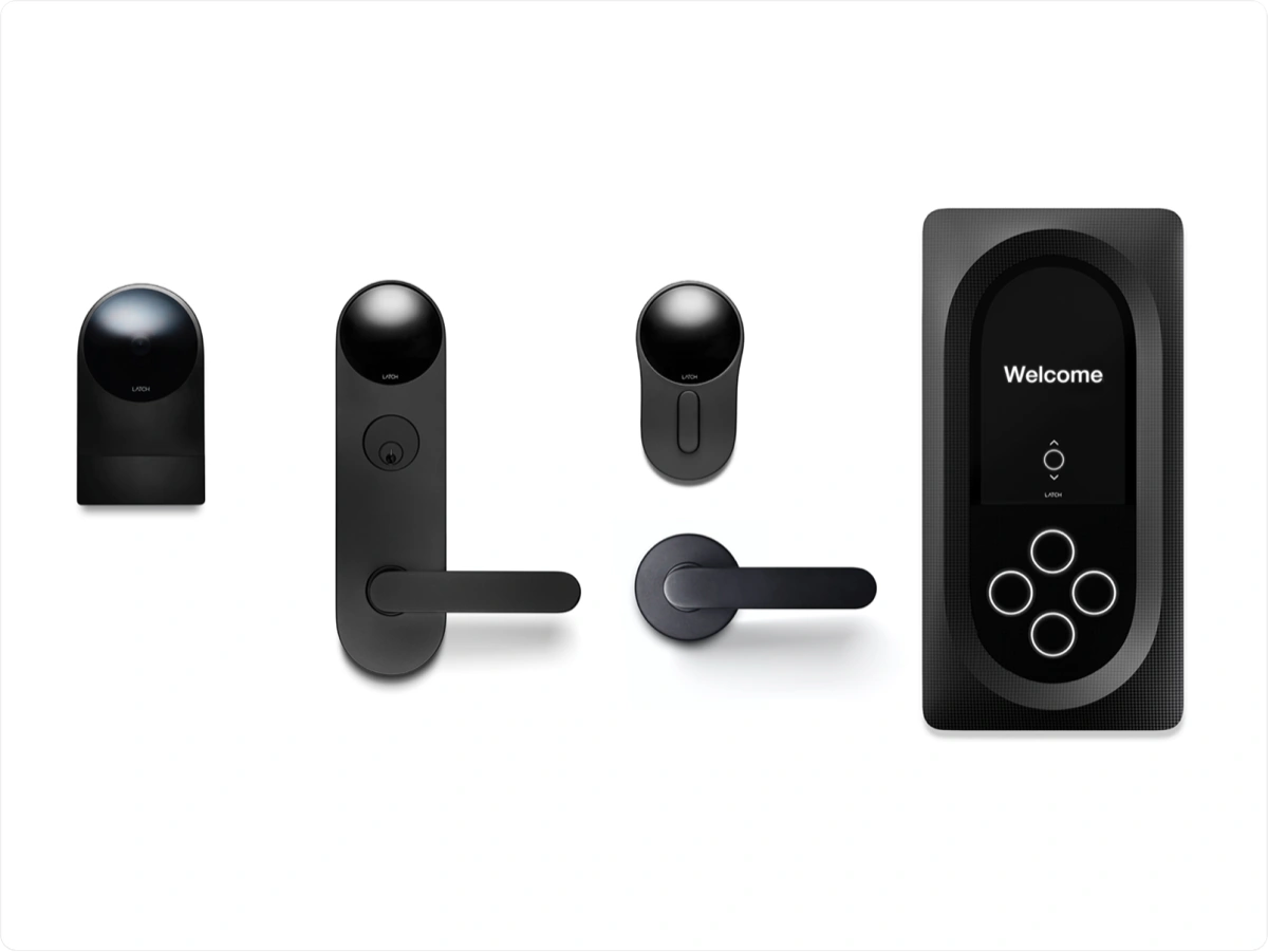
Running in parallel, the design team I lead produced hundreds of marketing assets, retail packaging for more than ten hardware products, and rebuilt DOOR.com from scratch over the following two months.
All of it on the same tokens as the product. One system — not a brand book and a product that agreed to disagree.

How I led it
What I'd change
Phasing the work kept engineering unblocked, but it also meant phase 1 shipped screens I already knew were structurally wrong. For about six weeks the product looked new and behaved old — and some of that feedback was fair. Next time I'd ship one flagship flow fully restructured alongside the skin, so the direction is visible in production from day one, not just in Figma.